Crypto charts 101: How to read cryptocurrency charts


Why reading cryptocurrency charts is essential for traders
Reading cryptocurrency charts is essential for traders to find the best opportunities in the market, as technical analysis can help investors to identify market trends and predict the future price movements of an asset.
Technical analysis refers to analyzing statistical trends gathered over time to understand how the supply and demand of a specific asset influence its future price changes. Reading crypto market charts can help investors to make well-informed decisions based on when they expect bullish and bearish movements to end.
A bullish movement refers to an upward price movement pushed by bulls, which are an asset’s buyers. A bearish movement is a downward price movement stomped on by the bears, which are the asset’s sellers. Technical analysis can help traders to evaluate price trends and patterns on charts to find trading opportunities. The best crypto charts help to monitor market movements, but they do have some caveats.
What is technical analysis?
“Technical'' refers to analyzing the past trading activity and price variations of an asset, which according to technical analysts, might be useful predictors of future price movements of an asset. It can be used for any asset with historical trading data, which means stocks, futures, commodities, currencies and cryptocurrencies.
Technical analysis was first introduced by Charles Dow, the founder and editor of the Wall Street Journal and the co-founder of Dow Jones & Company. Dow was partly responsible for the creation of the first stock index, which was the Dow Jones Transportation Index (DJT).
Dow’s ideas were written over a series of editorials published in the Wall Street Journal, and after he passed away, were compiled to create what is now known as the Dow theory. Technical analysis, it’s worth noting, has since evolved through years of research to include the patterns and signals we know now.
The validity of technical analysis depends on whether the market has priced in all known information about a given asset, implying that the asset is fairly valued based on that information. Traders using technical analysis who employ market psychology believe that history will eventually repeat itself.
Technical analysts may incorporate fundamental analysis into their trading strategy to determine whether an asset is worth approaching and complement their decisions with analysis of trading signals to know when to buy and when to sell to maximize profit. Fundamental analysis is the study of financial information affecting an asset’s price to predict its potential growth. For a company’s shares, fundamental analysis may include looking into its earnings, industry performance, and brand value.
As technical analysts look to identify bullish and bearish price movements to help traders make more informed decisions.
Dow theory and the six tenets of Dow theory
Charles Dow helped to create the first stock market index in 1884. The creation of this index was followed by the creation of the Dow Jones Industrial Average (DJIA), which is a price-weighted index tracking the 30 largest publicly traded companies in the United States. Dow believed the stock market was a reliable way to measure business conditions within the economy and that by analyzing it, it was possible to identify major market trends.
Dow’s theory has undergone some changes thanks to contributions from several other analysts, including William Hamilton, Robert Thea and Richard Russell. Over time, some aspects of Dow’s theory lost emphasis, including its focus on the transportation sector. While traders still track the DJT, it’s not seen as a primary market index, while the DJIA is.
The theory has six main components known as the six tenets of Dow theory. Let’s go over them one by one in the sections below.
The market reflects everything
The first tenet of the Dow theory is one of the core principles of technical analysis: that the market reflects all available information in the prices of assets, and prices such information accordingly. For example, if a company is expected to report positive earnings, the market prices the asset upwards.
The principle is close to what’s nowadays known as the Efficient Market Hypothesis (EMH), which states that asset prices reflect all available information and trade at their fair value on stock exchanges.

There are three kinds of trends in the market
Dow’s theory also suggests that markets experience three kinds of trends. Primary trends are major market movements and tend to last months or years. Primary trends can either be a bull market, meaning that the prices of assets are moving up over time or a bear market, meaning they are moving down over time.
Within these primary trends, there are secondary ones, which may work against the primary trend. The secondary trends can be pullbacks in bull markets, where asset prices temporarily move back, or rallies in bear markets, where prices temporarily move up before continuing their downtrend.
There are also tertiary trends, which tend to last a week or a little over a week and are often just considered noise in the market that could be ignored, as it won’t affect long-term movements.
Primary trends have three phases
Traders can find opportunities by examining different trends. For example, during a bullish primary trend, traders can take advantage of a bearish secondary trend to buy an asset at a lower price before it keeps on rising. Recognizing these trends is difficult, especially taking into account the Dow theory as it says primary trends have three phases.
The first phase, the accumulation phase for a bull market and the distribution phase for a bear market, precedes a contrary trend and occurs when market sentiment is still predominantly negative on a bull market or positive during a bear market. During this phase, smart traders understand that a new trend is starting and either accumulate ahead of an upward movement or distribute ahead of a downward direction movement.
The second phase is called the public participation phase. During this phase, the wider market realizes a new primary trend has begun and either starts buying more assets to take advantage of upward price movements or selling to cut losses in downward movements. The second phase sees prices increase or decrease rapidly.
The final phase is called the excess phase during bull markets, and the panic phase during bear markets. During the excess or panic phase, the wider public continues to speculate while the trend is about to end. Market participants who understand this phase start selling in anticipation of a bearish primary phase or buying in anticipation of a bullish primary phase.

While there is no guarantee about the consistency of these trends, various investors consider them before making their decisions.
Indices must correlate
The fourth tenet of Dow theory suggests that a market trend is only confirmed when both indices indicate that a new trend is starting. According to the theory, if one index confirms a new primary upward trend while another remains in a primary downward trend, traders should not assume a new primary upward trend is starting.
Here, it’s worth pointing out Dow’s main indices at the time were the Dow Jones Industrial Average and the Dow Jones Transportation Average, which would naturally tend to correlate, as industrial activity was heavily linked to the transportation market back then.
Volume confirms trends
The fifth tenet of Dow theory says that trading volume should increase if the price of an asset is moving in the direction of its primary trend, and decrease if it is moving against it. Trading volume is a measure of how much an asset has been traded over a specific period, and is seen as a secondary indicator, wherein low volume signals that a trend is weak, while large trading volume signals that a trend is strong.
If the market sees a bearish secondary trend with low volume during a bullish primary trend, it means that the secondary trend is relatively weak. If the trading volume is significant during the secondary trend, it shows that more market participants are starting to sell.
Trends are valid until a reversal is clear
Finally, the sixth tenet of Dow theory suggests that trend reversals should be treated with suspicion and caution, as reversals in primary trends can simply be confused with secondary trends.
What are candlestick charts?
Cryptocurrency market trends can be looked at and analyzed in many ways, with several types of charts being available to traders. Crypto candlestick charts offer more information because of the nature of candlesticks.

Crypto candlestick charts show time across the horizontal access and private data on the vertical axis, just like line and bar graphs. The main difference is that candlesticks show whether the market’s price movement was positive or negative in a given period, and to what degree.
Crypto market charts can be set to different timeframes, with candlesticks representing that timeframe. If a crypto trading chart is set to a four-hour timeframe, for example, each candlestick will represent four hours of trading activity. The trading period chosen depends on a traders’ style and strategy.
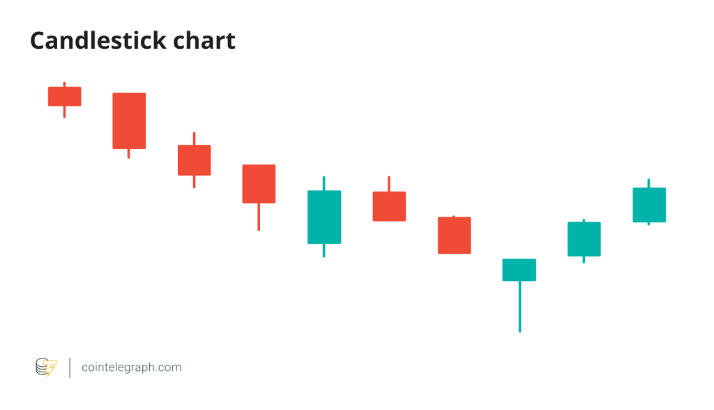
A candlestick is essentially made up of a body and wicks. The body of each candlestick represents its opening and closing prices, while the top wick represents how high the price of a cryptocurrency got during that time frame, and the bottom wick represents how low it got.
Similarly, candlesticks may have two different colors: green or red. Green candles show the price went up over the period under consideration, while red candles show that the price declined.
The simple structure of candlesticks can offer users a lot of information. Technical analysts may use candlestick patterns to, for example, identify potential trend reversals. Cryptocurrency traders should be aware of bullish and bearish candlestick patterns.
A long wick at the top of a candle’s body can, for example, suggest traders are taking profits and a sell-off may be occurring soon. On the contrary, a long wick at the bottom could mean traders are buying the asset every time the price drops.
Similarly, a candlestick in which the body occupies almost all of the space and has very short wicks, may mean that there’s strong bullish sentiment if it’s green or strong bearish sentiment if it’s red. On the other hand, a candlestick with almost no body and long wicks signals that neither buyers nor sellers are in control.
Support and resistance levels
Reading live crypto candlestick charts is easier using support and resistance levels, which can be identified with the use of trendlines. Trendlines are lines drawn on charts by connecting a series of prices.
Support levels are price points during pullbacks in which cryptocurrencies or any other asset are expected to halt due to a concentration of buying interest at that level. Resistance levels are price points in which there’s concentrated selling interest. Concentrated buying and selling interests make it hard to get past these levels.
Support and resistance levels can be identified through trendlines, as these make it easier to identify crypto chart patterns. An uptrend line is drawn using a cryptocurrency’s lowest and second-lowest lows in a given timeframe. Levels touching this trendline are seen as support.
A downtrend line is drawn using the crypto’s highest and second-highest highs, with levels touching this line being seen as resistance levels. As the name suggests, downtrend lines are used during downtrends, while uptrend lines are used. Various strategies can be used based on trendlines and support and resistance levels. For instance, some technical analysts simply buy near the support of uptrend lines and sell near the resistance of downtrend lines.
Often, the price of a cryptocurrency may move sideways in a somewhat stable range. Between September and November 2018, for example, Bitcoin (BTC) traded between $6,000 and $6,500 before dropping to $3,200 by December 2018. In this case, resistance levels are at the top of the range, while support levels are at the bottom of the range. A breakdown may occur if the price of the cryptocurrency drops below that range with a strong movement, or a breakout if it moves upward with a strong price movement.
Support and resistance levels can also be determined using long-term moving averages. These are common technical indicators that smooth price data by creating a constantly updated price average.
What are moving averages?
A moving average (MA) is one of the most commonly used types of technical indicators and essentially cuts out the noise by generating an average price for a given cryptocurrency. Moving averages can be adjusted to periods and offer useful signals when trading in real-time crypto charts.
The most commonly used moving averages are used for 10, 20, 50, 100, or even 200-day periods. These make market trends more visible, with a 200-day moving average being considered a support level during an uptrend, and a resistance level during a downtrend.
There are different types of moving averages used by traders. A simple moving average (SMA) simply adds together the average price of an asset over a determined period and divides it by the number of periods.

A weighted moving average (WMA) gives more weight to recent prices to make them more responsive to new changes. Similarly, an exponential moving average (EMA) gives more weight to recent prices but is not consistent with the rate of decrease between one price and its preceding price.
Moving averages are lagging indicators as they are based on past prices. Traders often use moving averages as signals to buy and sell assets, with the periods determined depending on their timeframes.
The 50-day and 200-day moving averages are closely watched in crypto trading charts, as when the 50-day SMA crosses below the 200-day SMA, a so-called death cross is formed, suggesting an impending price drop. When the 50-day SMA crosses above the 200-day SMA, a golden cross is formed, suggesting a price rise.
Other main technical indicators
Here, we’ll take a look at various other popular technical indicators out there.
On-balance volume indicator (OBV)
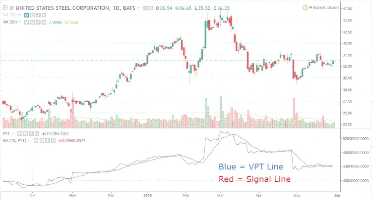
The on-balance volume indicator is a technical indicator focusing on a cryptocurrency’s trading volume. It was created by Joseph Granville under the belief that trading volume was a major driver of price movements in the markets.
The OBV is a cumulative indicator that rises and falls based on the trading volume of the days included within a specific period. It is used to confirm trends, as when looking at live crypto charts traders should see rising prices accompanied by a rising OBV. Falling prices should be accompanied by a falling OBV.
The OBV is calculated in various ways as follows:

Moving average convergence divergence (MACD)
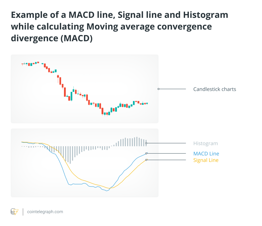
The moving average convergence divergence is an indicator that measures the difference between the 12-day and 26-day EMAs to form the MACD line and is used to identify both buy and sell signals. It’s an oscillator, meaning it’s an indicator that fluctuates above and below a centered line.
When the 12-day EMA crosses below the 26-day EMA, the MACD shows a sell signal, while the opposite signals it’s time to buy the asset under consideration. The greater the distance between both lines, the stronger the MACD’s reading is!
The indicator also has a signal line, which is a 9-day EMA. The MACD crossing above the signal often implies it’s time to buy while crossing below it implies it’s time to sell. The MACD indicator also includes a histogram for measuring the difference between the MACD and the signal line.

Relative Strength Index (RSI)
The relative strength index (RSI) is a momentum indicator used to measure whether an asset is being overbought or oversold. The RSI is shown as an oscillator, meaning a line between two extremes, and can range from 0 to 100.
The indicator uses a 14-day timeframe and a cryptocurrency is considered oversold when its value drops below 30 and is considered overbought when its value moves over 70. Being overbought is a sell signal while being oversold is a buy signal.
Bollinger bands
Developed by John Bollinger, Bollinger bands help traders to identify short-term price movements in the prices of assets, including cryptocurrencies. The Bollinger bands are created by using a 20-day moving average, and adding and subtracting a standard deviation from the moving average.
The parameters of the Bollinger bands can be customized, with the bands expanding and contracting based on the price of the cryptocurrency. The bands show periods of higher or lower volatility and are not supposed to be used on their own, but with other indicators as well.
When the price of a cryptocurrency moves above the upper band, it’s considered overbought, while a move under the lower band is considered oversold. Bollinger bands are based on the concept that periods of low volatility are followed by periods of high volatility, implying that when the bands separate during periods of high volatility, the ongoing trend may be coming to an end. Similarly, when the bands are close together, the asset may be due for a period of high volatility.


… [Trackback]
[…] Find More on that Topic: x.superex.com/academys/beginner/3190/ […]
… [Trackback]
[…] Find More on to that Topic: x.superex.com/academys/beginner/3190/ […]
… [Trackback]
[…] There you can find 14973 additional Info to that Topic: x.superex.com/academys/beginner/3190/ […]
… [Trackback]
[…] Read More here on that Topic: x.superex.com/academys/beginner/3190/ […]
… [Trackback]
[…] Find More to that Topic: x.superex.com/academys/beginner/3190/ […]
… [Trackback]
[…] Info to that Topic: x.superex.com/academys/beginner/3190/ […]
… [Trackback]
[…] Information to that Topic: x.superex.com/academys/beginner/3190/ […]
… [Trackback]
[…] Read More Information here to that Topic: x.superex.com/academys/beginner/3190/ […]
… [Trackback]
[…] Here you can find 4296 additional Info on that Topic: x.superex.com/academys/beginner/3190/ […]
… [Trackback]
[…] Here you can find 94788 additional Information on that Topic: x.superex.com/academys/beginner/3190/ […]
… [Trackback]
[…] Find More Information here to that Topic: x.superex.com/academys/beginner/3190/ […]
… [Trackback]
[…] Here you can find 48024 additional Information to that Topic: x.superex.com/academys/beginner/3190/ […]
… [Trackback]
[…] There you will find 97044 more Info to that Topic: x.superex.com/academys/beginner/3190/ […]
… [Trackback]
[…] Find More on to that Topic: x.superex.com/academys/beginner/3190/ […]
… [Trackback]
[…] Read More here to that Topic: x.superex.com/academys/beginner/3190/ […]
… [Trackback]
[…] There you can find 83294 more Info to that Topic: x.superex.com/academys/beginner/3190/ […]
… [Trackback]
[…] Info to that Topic: x.superex.com/academys/beginner/3190/ […]
… [Trackback]
[…] Read More to that Topic: x.superex.com/academys/beginner/3190/ […]
… [Trackback]
[…] Find More here to that Topic: x.superex.com/academys/beginner/3190/ […]
… [Trackback]
[…] Here you will find 14049 additional Info on that Topic: x.superex.com/academys/beginner/3190/ […]
… [Trackback]
[…] Find More on that Topic: x.superex.com/academys/beginner/3190/ […]
… [Trackback]
[…] Info to that Topic: x.superex.com/academys/beginner/3190/ […]
… [Trackback]
[…] Read More on to that Topic: x.superex.com/academys/beginner/3190/ […]
… [Trackback]
[…] Find More on that Topic: x.superex.com/academys/beginner/3190/ […]
… [Trackback]
[…] Find More Information here on that Topic: x.superex.com/academys/beginner/3190/ […]
… [Trackback]
[…] Find More Information here to that Topic: x.superex.com/academys/beginner/3190/ […]
… [Trackback]
[…] Read More to that Topic: x.superex.com/academys/beginner/3190/ […]
… [Trackback]
[…] Info on that Topic: x.superex.com/academys/beginner/3190/ […]
… [Trackback]
[…] Info to that Topic: x.superex.com/academys/beginner/3190/ […]
… [Trackback]
[…] Read More on that Topic: x.superex.com/academys/beginner/3190/ […]
… [Trackback]
[…] Read More Info here to that Topic: x.superex.com/academys/beginner/3190/ […]
… [Trackback]
[…] Find More Information here on that Topic: x.superex.com/academys/beginner/3190/ […]
… [Trackback]
[…] Information on that Topic: x.superex.com/academys/beginner/3190/ […]
… [Trackback]
[…] Info to that Topic: x.superex.com/academys/beginner/3190/ […]
… [Trackback]
[…] Read More to that Topic: x.superex.com/academys/beginner/3190/ […]
… [Trackback]
[…] Find More Info here on that Topic: x.superex.com/academys/beginner/3190/ […]
… [Trackback]
[…] Information on that Topic: x.superex.com/academys/beginner/3190/ […]
… [Trackback]
[…] Information on that Topic: x.superex.com/academys/beginner/3190/ […]