LEARN HODL WAVES INDEX IN 3 MINUTES ——BLOCKCHAIN 101

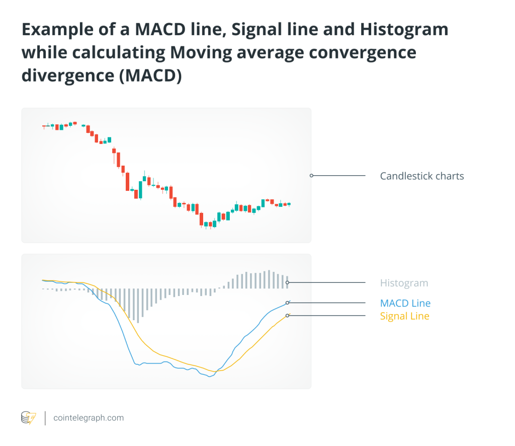
In crypto, not knowing candlestick charts isn’t a big deal.But if you’ve never heard of HODL Waves, then it’s time for a quick catch-up.This is one of the most symbolic charts in on-chain analysis—visually striking and packed with insights.It can help you tell whether the market is in “dump retail” mode or “cheap entry” mode.
Don’t be afraid of how complicated it looks.Today, just spend three minutes to really understand what this indicator is for—and the logic behind it.
- Click to register SuperEx
- Click to download the SuperEx APP
- Click to enter SuperEx CMC
- Click to enter SuperEx DAO Academy — Space

What Are HODL Waves? Let’s Keep It Simple:
HODL Waves is a chart that shows the distribution of Bitcoin holding addresses by holding age.You can think of it as a heatmap + age distribution for BTC.
A quick example:
-
Someone who’s held BTC for over 5 years = “old school holder”
-
Someone who just bought BTC = “fresh blood”
These different “ages” of BTC together form wave-like layers—hence the name HODL Waves.
The chart divides all circulating BTC into age bands (like 1 day–1 week, 1 week–1 month, 1–3 months … 5+ years) and colors them accordingly.What you get is a beautiful, ocean-like wave chart.
How to Read the Chart?
1. The darker the color, the “older” the coin
-
Deep red and purple = coins that haven’t moved in 5+ years
-
Light yellow and orange = coins held for under 1 month (short-term speculators)
2. The smoother the waves, the calmer the market
When most BTC stays unmoved for long periods, it means holders are choosing to sit tight.This usually happens during bear markets, when sentiment is low.
3. Choppy waves? That could mean a bull run is coming
When short-term holdings spike, it means more people are buying/selling rapidly.HODL Waves turns lighter (more yellow/orange).This “turbulence” typically signals the start or top of a bull market.
A Quick Example: 2017
-
Before the bull run:Many “old holders” had been sitting on BTC for years.HODL Waves showed a higher proportion of dark colors—long-term coins dominated.
-
During the bull run:New capital flooded in, more “young coins” appeared.The orange/yellow areas on the chart ballooned—activity surged.
-
During the bear market:Short-term holders got trapped. Only long-term holders stayed strong.HODL Waves shifted back to deeper colors.
In short: lighter colors = excitement, darker colors = accumulation.The rhythm of HODL Waves syncs perfectly with market emotions.
So… What’s the Point of This Indicator?
HODL Waves won’t directly tell you if prices will go up or down.But it will tell you whether the market is currently “hot or cold.”
Use Case 1: Identify Market Cycles
-
High long-term holding ratio → quiet market, maybe it’s time to accumulate
-
Sudden spike in short-term holdings → overheated market, possibly nearing a top
Use Case 2: Spot FOMO
If you see short-term waves (1 day to 1 month) suddenly growing fast,that likely means retail is rushing in, and the market might be getting too hot—time to be cautious.
Use Case 3: Support Buy-the-Dip or Trim Positions
-
More “old coins” = more stability → may be a good entry point
-
More “new coins” = more hype → stay alert, protect your gains
Final Thoughts: Not for Prediction—But for Mindset Reading
The real value of HODL Waves is this: it lets you see the emotional flow of the market.
Look—it’s not a trading signal light. It’s a truth mirror.It won’t tell you if BTC will pump tomorrow,but it will show you how many people are truly in it for the long term—and how many are just chasing pumps or panic selling.
Learning HODL Waves in 3 minutes might not make you rich overnight,but it will definitely help you avoid a few landmines in this wild crypto world.


Responses